Advice from me
KISS chase – How to keep your exhibit simple
K.I.S.S. – “Keep It Simple Stupid” is a truism. It's the kind of thing that a David Brent like manager tells you, just after telling you about his complicated plan to perform War and Peace
with sock puppets. But just because a truism is easier to say than do
doesn't make it wrong. Indeed, some of the most successful commercial
enterprises have taken the maxim “do one thing, but do it very well”. A
classic example is Google with it’s now well known simple front page.
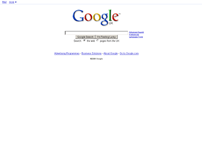
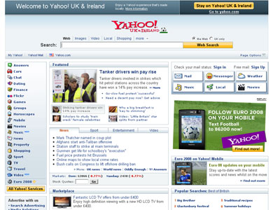
Compare this with their closest competitor, Yahoo.
Everyone knows what Google does – it lets you find things and this is
reflected in the page. Now look at the Yahoo page – it’s a complicated
mix of things, some news, a search box, trying to sell you a new TV –
it’s difficult to know what to choose, what Yahoo are best at and why you
should use it rather than someone else.
If it's good for Google is it good for me?
So is simplicity important for museum exhibits anyway? Isn’t it just “dumbing down”? A better way of thinking about it is “keeping focused”. Exhibitions are strange, unfamiliar places and visitors will spend only a few seconds deciding whether your exhibit is something they should spend time on.
A client once asked me “How much information can the memory of the exhibit computer hold?” I told him that for practical purposes there was no limit. This is true. A typical 250GB hard drive can easily hold the equivalent of half a million novels. However, what I should have told him is that an average exhibit is used for around 3 minutes and that a typical adult has a reading speed of around 200 words a minutes. This means that people may read up to around 600 words of your exhibit – although they’ll also stop as soon as they get bored or there’s something they don’t understand.
Add to this the need to maximise your limited resources and keeping it simple becomes a necessity for most projects. So how do you stop your exhibit getting too complicated?
Have a clear aim and audience
If you want to keep your exhibit simple the most important thing is to have a clearly defined aim for the exhibit and audience. When you develop an exhibit you’ll have to consider a large number of different options. This lets you focus in on what’s really important for the exhibit and throw out other ideas which feel attractive but make it more complicated and drain resources from what really matters. You'll also find a clear aim and audience essential for writing the rest of the brief and doing audience evaluation as discussed below.
Be prepared to throw out most of your ideas
A client once asked me to come up with a proposal for an exhibit. I went away and developed a proposal to deliver the exhibit’s message using a game. When I came back with the proposal the client said “We assumed you’d come back with a quiz, we couldn’t think of any other way of doing it – so we’ve already written the quiz questions. But we really like the game idea – is there a way of having the game but using the questions we’ve written?” I managed to put the quiz into the game and the client was happy with the end result. However, we then found that some visitors didn't make it to the end of the the exhibit because “it took too long to play”. With hindsight we should have gone with the game or the quiz – not both.
When you sit down to plan an exhibit it’s likely that you’ll have several different ideas of how it could work. If there’s a group of you involved it’s likely that you’ll have a lot of ideas. This is good – having ideas is fine. The trick is to realise that more ideas doesn’t make it a better exhibit – often it makes it worse. Ideally what you want to end up with is just one really good defining idea for the exhibit. Throwing out ideas is particularly difficult if there’s a group of you – most people’s ideas won’t end up in the exhibit so make sure you de-personalise the decision as much as possible.
Beware of clever ideas
The most difficult ideas to throw out are the cleverest. Clever ideas are very seductive, particularly when they help us combine two previously opposing positions. In the quiz game example above, I came up with a way of inserting the quiz questions into the game. The game was a race against the clock and we needed to keep the tension up while still giving people time to read the questions. The solution we came up with is to play a ticking clock sound all through the game, including the quiz. However, the clock was actually stopped during the quiz to give people time to read the questions. That way people still felt the time pressure but had time to complete the quiz no matter how slow a reader they were.
This worked fairly well and we were pretty pleased with ourselves. In retrospect the “cleverness” of the idea distracted us from the more fundamental problem that the exhibit was too long and we should either have had a quiz or a game. What makes it difficult is that some clever ideas do actually improve the exhibit. A good rule of thumb is to ask yourself “does this idea make the exhibit simpler?” If it does then it’s probably a good one.
Writing a complete brief is a wicked problem
The classic Parkinson’s Law describes a typical management meeting scenario. The first item on the agenda is a new nuclear power station costing millions. As it happens, only one person at the meeting has any technical knowledge of the project and no one else feels confident to discuss it. As a result, discussion of the item is brief and over in several minutes. Further down the agenda is a project to build a new bike shelter. This is something everyone can understand, the budgets are more approachable and issues such as how to appoint a builder are much more familiar. Discussion on this issue continues for 40 minutes Participants feel that they’ve achieved something and progress has been made.
Writing a brief for a computer exhibit is often similar to this. The most important parts of the exhibit often turn out to be the most difficult to write about. You want your exhibit to be engaging and fun and easy to use but these are all pretty difficult to pin down. It’s much easier to write pages and pages about every single idea you've had or concern that you've thought of. The danger is that this becomes a self fulfilling brief and that you and your contractor spend all your resources on the long but less important points of the brief rather than what's really important.
It's easy to write about the less important stuff
I once worked on a project with a very short time scale. The brief stated that the exhibit should have five or six different sets of content so that visitors would see different content every time they played. As a result it took the client five times longer to write the content and it took us much more time to produce the assets (illustrations etc) to make it work. The client was fairly happy with the final result but did mention that once it was on gallery some visitors were “a bit confused as to how to play”. I asked “didn't you pick that up by testing the prototypes we sent you?”, “Oh no, we didn't test the prototypes on actual visitors, we didn't have time, we were too busy writing all the content...”
Agile is good
This problem with writing a brief is well known in the software world. The idea of trying to write every single detailed requirement in the brief is known as The Waterfall Model and it has been heavily criticised – most notably in Steve McConnell's classic Rapid Development. McConnell argues that a definitive detailed brief is impossible to write, and called the task a “wicked problem". The solution is what are known as Iterative models. Rapid Development describes several varieties of iterative method and there are many more, often described as Agile methods. What they all have in common is:
- The brief doesn't attempt to describe every detail of the finished product. What it tries to do is lay down a series of priorities. So in the example above, the brief would state as a top priority that the exhibit should be easy to use and communicate content X. It would still be possible to mention the desirability of alternative content but this should be flagged as lower priority.
- Part of the development process is then to produce a series of prototypes. Each prototype attempts to satisfy the highest priority items in the brief.
- The prototype is then tested to see if does what is needed. So in the example above, a prototype would be produced which attempts to communicate the core content. It would then be tested on visitors to see if it did this and was easy to use. If successful then the next prototype can address lower priority items.
Remember, that more is not always more
Choosing a contractor from a pitch submission is not easy. Ideally you're looking for a company which is enthusiastic, offers good value for money and won't charge you extra for changes to the brief and requirements. A common way to do this is to choose the contractor whose pitch offers the most “features”. So if contractor A offers a game and a video but contractor B offers a game, a video and a quiz then contractor B offers better value so we'll chose them. There is some merit to this reasoning but it doesn’t help keep exhibits simple.
Another common situation is when you've got several ideas for an exhibit but can't decide which one to choose. In this case clients often think “well we can't decide, so let’s ask the contractors to come up with a creative solution which uses all of them”. Often these ideas contradict each other but it takes a very brave (and probably foolish) contractor to say “actually we think you'd be better off just choosing one of these”. Instead they put their best persuasive efforts into telling you that these ideas can be combined to create a better exhibit and it’s easy to be persuaded as this means you don't have to make a difficult decision. Sometimes this does result in a better exhibit, but more often the end result is a schizophrenic mixture with none of the concepts executed particularly well. As client there are several things you can do to prevent this:
- Try not to give contradictory aims for the exhibit. By all means ask the contractor to be creative but if you find yourself asking for “the exhibit time to be less than three minutes and contain thousands of words of detailed content” or “a highly challenging, fun and easy to use experience” then you need to focus your aims.
- Even if the contractor does propose “a longer list” of features than their competitors be prepared to drop some of the features even though they've said they'll do them within the budget. That way you'll get a simpler, better exhibit and the contractors will feel they've got a bonus and devote the extra time to making the features you do want better.
Focused exhibitions create focused exhibits
Strangely, exactly the same issue affects exhibition professionals and their funders. During the grant application process it's typical for applicants to promise “a longer list” of features because they know that this will “tick more boxes” for the funding body. Although funders may feel that some of the features contradict each other, they're more likely to be persuaded rather than ask for the list to be shorter or more focused. This is how proposals can claim “to present a complete picture of cutting-edge research with no simplification or dumbing down” to “a family audience with children from the age of four”. As with individual exhibits the end result is often a schizophrenic exhibition with one set of exhibits for the target audience and another for the funders.
Test on real people
In Designing Interactions Bill Moggridge describes how the Apple Lisa (the precursor to the Macintosh) was developed. “Bill (Atkinson) and Larry (Tesler) formed a close partnership... Bill would work nights and Larry would work days. During the night Bill would make prototypes of user interface concepts... Then Larry would run user tests during the day... Larry would give Bill a report at the end of the day and they'd decide what to do next”.
User testing is a key tool in making exhibits simple, usable and effective. I'm not suggesting that you follow Bill and Larry's nocturnal regime to the letter but you’d be surprised how much difference trialling development prototypes with the target audience can make. In the previous section on writing a brief we discussed how it’s fairly easy to describe your priorities in general terms (“fun”,”user-friendly” etc.) but almost impossible to confidently specify in a written document exactly how this will be achieved. User testing lets you find out how well you're achieving these aims and give you insight into how to improve things. Normally you'll find that the answer isn't to add yet more to the list of features – it's to make subtle changes to the features you already have.
Just because you can use it, doesn't mean others can
But why is important to test on actual visitors? The simple answer is that everyone involved in developing the exhibit has already spent too much time with it to have a visitor's perspective. Consider that a typical visitor probably spends around three minutes with your exhibit whereas the typical museum professional or exhibit contractor probably has at least three years experience of the subject area and has spent three months planning and discussing the exhibit before a prototype is produced. It’s clear that the different parties will have very different approach to the exhibit and the one thing everyone involved in visitor testing says is “we were surprised by the results”. Don't fall into the trap of thinking “If I can use it anyone can” - this is almost never the case. (Although the converse “I can't use it so what hope has anyone else” is more likely).
Previously we discussed how difficult it is to throw out “pet” ideas. One of the great strengths of audience evaluation is that it de-personalises this process. You can tell yourself or your colleagues “yes it was a great idea on paper, but when we tested it the visitors just didn't get it”.
The secret of simplicity
Well, as all this shows the secret of simplicity is - that there isn't one. There isn't one definitive (er, simple) reason why exhibits become more complex than they need to be. More likely there's a number of stages during development which have the potential to complicate or simplify things. I hope I've given you some idea where these stages are and if every time you come across them you ask yourself "How can this be made simpler?" I think you'll see an improvement.
You might also be asking how I've managed to write several thousand words on the idea of simplicity. To which I'll leave you the (oft-quoted) words of Blaise Pascal.
"I have made this letter longer than usual, because I lack the time to make it short".
Further reading
Made to Stick, Chip and Dan Heath
Made to Stick
examines the psychological evidence about what makes some ideas more
memorable or "sticky" than others. Curiously enough, being simple and
focused stands out as major factors.
The Laws of Simplicity, John Maeda
Design guru John Maeda has been looking into creating some general laws for keeping things simple. The associated web site is also well worth a look.
Rapid Development: Taming Wild Software Schedules , Steve McConnell
Steve McConnell is a renowned authority on software development. In Rapid Development he
examines both best and worst practice development methods. Full of easy
to grasp drawings and real world experience but short on pontificating
its a good introduction to software project management.
Designing Interactions, Bill Moggridge
Bill Moggridge was one of the founders of design agency IDEO. Here he's
tracked down the people responsible for some of the best designed
products and got them to say in their own words how it was done.
Parkinson's Law, C Northcote Parkinson
Parkinson's Law
is a classic text looking at the difference between perceptions of work
and what actually happens. Based on observations of civil servants, its
also very funny.
A great parody video showing what would happen if another company without the "keep it simple" ethos tried to copy the iPod.
© Joe Cutting 2008. You are welcome to
use this document for your own purposes but you must retain this acknowledgment.
You may not sell all or any part of this document or use it for financial
gain.
 Back to top